The R package {gt} is becoming increasingly popular for creating aesthetically pleasing tables. nflplotR supports rendering of team logos, team wordmarks, and player headshots in gt tables similar to ggplot2. This article will provide some typical examples.
Team Logos & Wordmarks
The functions gt_nfl_logos() and
gt_nfl_wordmarks() come with a powerful
locations argument that allows usage of gt selection
helpers. We will create an example dataframe to show how this all
works.
df <- data.frame(
  row_group_column = c("AFC", "NFC", "AFC", "NFC"),
  row_name_column = c("LAC", "SEA"),
  column_a = 11:12,
  column_b = c("KC", "LA")
)
Our example dataframe in a gt table without any formatting.
gt::gt(df)| row_group_column | row_name_column | column_a | column_b |
|---|---|---|---|
| AFC | LAC | 11 | KC |
| NFC | SEA | 12 | LA |
| AFC | LAC | 11 | KC |
| NFC | SEA | 12 | LA |
The column row_group_column is intended to serve as row
group variable so let’s apply this.
gt::gt(df, groupname_col = "row_group_column")| row_name_column | column_a | column_b |
|---|---|---|
| AFC | ||
| LAC | 11 | KC |
| LAC | 11 | KC |
| NFC | ||
| SEA | 12 | LA |
| SEA | 12 | LA |
We also would like to render images in the stub, i.e. the rownames so
we tell gt about the row_name_column.
example_table <- gt::gt(
  df,
  groupname_col = "row_group_column",
  rowname_col = "row_name_column"
) |>
  # align the complete table left
  gt::tab_options(
    table.align = "left"
  )
example_table| column_a | column_b | |
|---|---|---|
| AFC | ||
| LAC | 11 | KC |
| LAC | 11 | KC |
| NFC | ||
| SEA | 12 | LA |
| SEA | 12 | LA |
This is our final table. We have valid NFL abbreviations in the cell body, in row group labels and in the stub. We can now use nflplotR to render images instead of those abbreviations.
Cell Body
To render images in the cell body, i.e. the rows of the table, we can
either use the columns argument or the appropriate
locations helper.
example_table |>
nflplotR::gt_nfl_logos(columns = "column_b")| column_a | column_b | |
|---|---|---|
| AFC | ||
| LAC | 11 | |
| LAC | 11 | |
| NFC | ||
| SEA | 12 | |
| SEA | 12 | |
Please note, that the locations helper will allow you to selectively apply the function to a set of rows
example_table |>
nflplotR::gt_nfl_logos(locations = gt::cells_body(rows = gt::starts_with("LAC")))| column_a | column_b | |
|---|---|---|
| AFC | ||
| LAC | 11 | |
| LAC | 11 | |
| NFC | ||
| SEA | 12 | LA |
| SEA | 12 | LA |
Row Group Label
Rendering images outside of the cell body will always require the
appropriate call to the locations argument. The
columns argument cannot handle anything outside cell
bodies.
example_table |>
nflplotR::gt_nfl_logos(locations = gt::cells_row_groups())| column_a | column_b | |
|---|---|---|
| LAC | 11 | KC |
| LAC | 11 | KC |
| SEA | 12 | LA |
| SEA | 12 | LA |
Stub
Now we would like to convert rownames to images.
example_table |>
nflplotR::gt_nfl_wordmarks(locations = gt::cells_stub())| column_a | column_b | |
|---|---|---|
| AFC | ||
| 11 | KC | |
| 11 | KC | |
| NFC | ||
| 12 | LA | |
| 12 | LA | |
Column Spanners
We use another table to demonstrate how to convert team names to logos and wordmarks in column spanners.
Here only logos
df <- data.frame(a = 3, b = 4, c = 5, d = 6)

df |>
  gt::gt() |>
  gt::tab_spanner("KC", c(a, b)) |>
  gt::tab_spanner("LAC", c(c, d)) |>
nflplotR::gt_nfl_logos(locations = gt::cells_column_spanners())|
|
|
||
|---|---|---|---|
| a | b | c | d |
| 3 | 4 | 5 | 6 |
And now mix logo and wordmark
df <- data.frame(a = 3, b = 4, c = 5, d = 6)

df |>
  gt::gt() |>
  gt::tab_spanner("KC", c(a, b)) |>
  gt::tab_spanner("LAC", c(c, d)) |>
  nflplotR::gt_nfl_logos(locations = gt::cells_column_spanners("KC")) |>
nflplotR::gt_nfl_wordmarks(locations = gt::cells_column_spanners("LAC"))|
|
|
||
|---|---|---|---|
| a | b | c | d |
| 3 | 4 | 5 | 6 |
Combine all together
The locations argument allows multiple locations in one
call by wrapping them in a list.
example_table |>
  nflplotR::gt_nfl_wordmarks(locations = gt::cells_stub()) |>
  nflplotR::gt_nfl_logos(
    locations = list(
      gt::cells_body(), gt::cells_row_groups()
    )
)| column_a | column_b | |
|---|---|---|
| 11 | ||
| 11 | ||
| 12 | ||
| 12 | ||
How about Column Labels?
Well…it’s complicated, because gt behaves inconsistent in my opinion.
The actually correct way would be a call to
nflplotR::gt_nfl_logos or
nflplotR::gt_nfl_wordmarks with the locations
argument set to gt::cells_column_labels(). Currently, this
wouldn’t render any images in column labels as discussed in the above
linked issue.
However, as a convenient workaround, nflplotR supports logos and
wordmarks in column labels through gt_nfl_cols_label().
LOGOS:
teams <- nflplotR::valid_team_names() |> head(6)
df <- cbind(1, 2, 3, 4, 5, 6) |>
  as.data.frame() |>
  rlang::set_names(teams)

gt::gt(df) |>
  nflplotR::gt_nfl_cols_label() |>
  # align the complete table left
  gt::tab_options(
    table.align = "left"
)| 1 | 2 | 3 | 4 | 5 | 6 |
WORDMARKS (note how non matches remain unchanged):
gt::gt(df) |>
  nflplotR::gt_nfl_cols_label(type = "wordmark") |>
  # align the complete table left
  gt::tab_options(
    table.align = "left"
)| AFC | |||||
|---|---|---|---|---|---|
| 1 | 2 | 3 | 4 | 5 | 6 |
HEADSHOTS:
headshot_df <- data.frame(
  "00-0036355" = 1,
  "00-0033873" = 2,
  check.names = FALSE
)
gt::gt(headshot_df) |>
  nflplotR::gt_nfl_cols_label(type = "headshot") |>
  # align the complete table left
  gt::tab_options(
    table.align = "left"
) |
 |
|---|---|
| 1 | 2 |
Logos and Wordmarks Rendered by nflplotR
This example creates a table that renders all team logos and wordmarks. We split the table into 2 x 16 rows to avoid an overly long table and convert all variables starting with “logo” to logos and all variables starting with “wordmark” to wordmarks.
teams <- nflplotR::valid_team_names()
# remove conference logos from this example
teams <- teams[!teams %in% c("AFC", "NFC", "NFL")]
# create dataframe with all 32 team names
df <- data.frame(
  team_a = head(teams, 16),
  logo_a = head(teams, 16),
  wordmark_a = head(teams, 16),
  team_b = tail(teams, 16),
  logo_b = tail(teams, 16),
  wordmark_b = tail(teams, 16)
)
# create gt table and translate team names to logo/wordmark images
df |>
  gt::gt() |>
  nflplotR::gt_nfl_logos(columns = gt::starts_with("logo")) |>
  nflplotR::gt_nfl_wordmarks(columns = gt::starts_with("wordmark")) |>
  # align the complete table left
  gt::tab_options(
    table.align = "left"
)| team_a | logo_a | wordmark_a | team_b | logo_b | wordmark_b |
|---|---|---|---|---|---|
| ARI | LA | ||||
| ATL | LAC | ||||
| BAL | LV | ||||
| BUF | MIA | ||||
| CAR | MIN | ||||
| CHI | NE | ||||
| CIN | NO | ||||
| CLE | NYG | ||||
| DAL | NYJ | ||||
| DEN | PHI | ||||
| DET | PIT | ||||
| GB | SEA | ||||
| HOU | SF | ||||
| IND | TB | ||||
| JAX | TEN | ||||
| KC | WAS |
Player Headshots
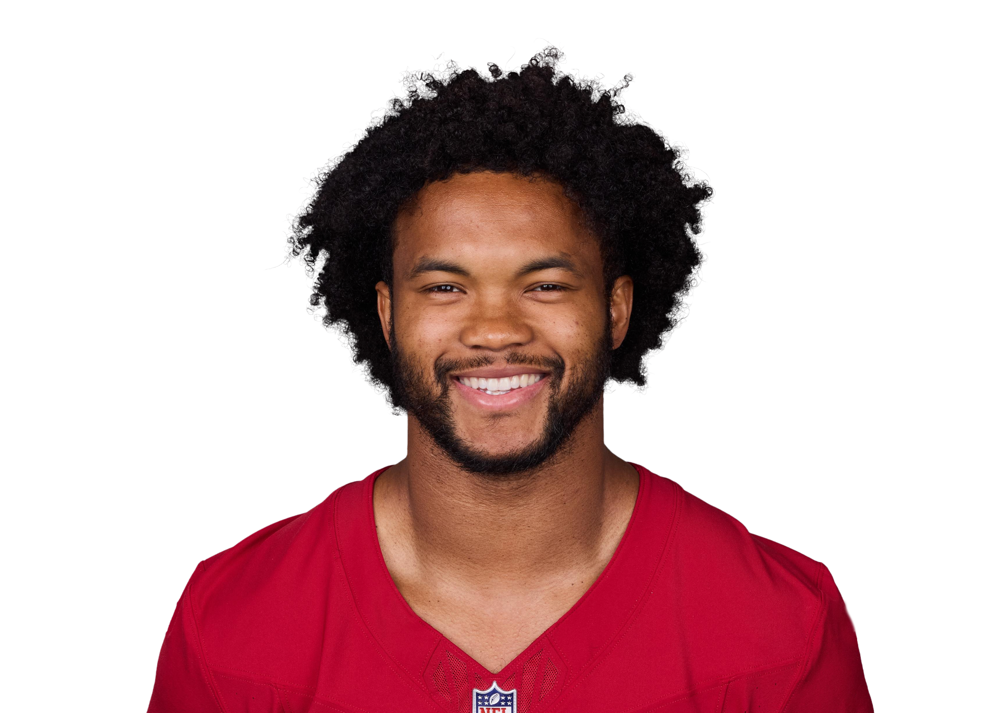
All of the above applies to gt_nfl_headshots() as well.
All you need is a gsis ID.
df <- data.frame(
  A = c("00-0036355", "00-0033873"),
  B = c("00-0033077", "00-0035228")
)

df |>
  gt::gt() |>
  nflplotR::gt_nfl_headshots(columns = gt::everything(), height = 50) |>
  # align the complete table left
  gt::tab_options(
    table.align = "left"
)| A | B |
|---|---|
 |
 |
 |
 |
Add Context to Data Values
When presenting data, whether in tables or other forms, context matters. For example, if you explain to a layperson that an NFL quarterback has a completion rate of 80%, they will not be able to interpret this value without context. Is it average, below average, or an incredible record?
There are various ways to add this context to tables. Statistically,
a particular value can be classified very well by specifying its
empirical quantile (usually given as a percentile). Once the percentiles
have been determined, one can use gt::cols_merge_n_pct, for
example, to add the context (the percentile) to the value. More complex
styles can be implemented using the pattern argument in
gt::cols_merge.
This chapter introduces another method of graphically representing quantiles in tables. The basic idea is that a “progress bar” is rendered which is filled between 0% and 100%, depending on the empirical quantile. Let’s take a look at some examples below.
Example Data
df <- data.frame(
  letters = sample(LETTERS, 10, TRUE),
  value = sample(100:500, 10, FALSE),
  pctl = rev(c(0, 1, 5, 10, 20, 45, 50, 75, 98, 100))
)
The Inline Percentage Bar
By default, a bar is inserted and the value is printed inside the
bar. We set hide_col_pct (which is not the default) to make
it easier to understand how the filling corresponds to the values in
pctl.
gt::gt(df) |>
  nflplotR::gt_pct_bar(
    "value", "pctl",
    hide_col_pct = FALSE
)| letters | value | pctl |
|---|---|---|
| J | 184 | 100 |
| H | 413 | 98 |
| V | 128 | 75 |
| Q | 429 | 50 |
| L | 201 | 45 |
| T | 241 | 20 |
| O | 421 | 10 |
| R | 136 | 5 |
| L | 463 | 1 |
| V | 231 | 0 |
This doesn’t really look good because values aren’t aligned and bars are short. So let’s change the column width and look again.
gt::gt(df) |>
  nflplotR::gt_pct_bar(
    "value", "pctl",
    hide_col_pct = FALSE
  ) |>
gt::cols_width(value ~ gt::px(200))| letters | value | pctl |
|---|---|---|
| J | 184 | 100 |
| H | 413 | 98 |
| V | 128 | 75 |
| Q | 429 | 50 |
| L | 201 | 45 |
| T | 241 | 20 |
| O | 421 | 10 |
| R | 136 | 5 |
| L | 463 | 1 |
| V | 231 | 0 |
The bars look better but notice how values are aligned right inside the filled bars. This is an important information that we can use to improve the style.
Now let’s align left and apply a left side padding:
gt::gt(df) |>
  nflplotR::gt_pct_bar(
    "value", "pctl",
    hide_col_pct = FALSE,
    value_padding_left = "10px"
  ) |>
  gt::cols_width(value ~ gt::px(200)) |>
gt::cols_align("left", "value")| letters | value | pctl |
|---|---|---|
| J | 184 | 100 |
| H | 413 | 98 |
| V | 128 | 75 |
| Q | 429 | 50 |
| L | 201 | 45 |
| T | 241 | 20 |
| O | 421 | 10 |
| R | 136 | 5 |
| L | 463 | 1 |
| V | 231 | 0 |
Two annoying things remain. Some values corresponding to small
percentiles overlap with the bars and very small percentiles (see
pctl <= 5) overlap the outline. We can fix overlapping
values and bars by applying separate padding values for every percentile
(all function arguments of gt_pct_bar are
vectorized). Rendering of very short percentile bars can be
messed up by the border radius of the bar, which is why we see bars
overlapping the outline. So let’s try and fix this
gt::gt(df) |>
  nflplotR::gt_pct_bar(
    "value", "pctl",
    hide_col_pct = FALSE,
    value_padding_left = ifelse(df$pctl < 25, "110%", "10px"),
    fill_border.radius = "3px",
    background_border.radius = "5px"
  ) |>
  gt::cols_width(value ~ gt::px(200)) |>
gt::cols_align("left", "value")| letters | value | pctl |
|---|---|---|
| J | 184 | 100 |
| H | 413 | 98 |
| V | 128 | 75 |
| Q | 429 | 50 |
| L | 201 | 45 |
| T | 241 | 20 |
| O | 421 | 10 |
| R | 136 | 5 |
| L | 463 | 1 |
| V | 231 | 0 |
The Extra Percentage Bar
As an alternative to the inline percentage bar, you can also place
the bar below the text. gt_pct_bar controls this via the
value_position argument. This approach allows for a
significantly flatter design of the bars, because the text is printed
outside the bar.
gt::gt(df) |>
  nflplotR::gt_pct_bar(
    "value", "pctl",
    hide_col_pct = FALSE,
    value_position = "above",
    # with value_position = "above", we need an absolute value of bar heights!
    background_fill.height = "5px",
    background_fill.color = "LightGray"
  ) |>
  gt::cols_width(value ~ gt::px(100)) |>
gt::cols_align("center", "value")| letters | value | pctl |
|---|---|---|
| J | 184 | 100 |
| H | 413 | 98 |
| V | 128 | 75 |
| Q | 429 | 50 |
| L | 201 | 45 |
| T | 241 | 20 |
| O | 421 | 10 |
| R | 136 | 5 |
| L | 463 | 1 |
| V | 231 | 0 |
Integrated Color Scales
gt_pct_bar can work with any color palette (= vector of
color names allowed in html). It also comes with 3 integrated palettes
named “hulk”, “hulk_teal”, and “blue_orange”. The default “hulk” palette
is used in the above examples. Below we’ll look at the other color
scales.
Here is an example with the integrated “hulk_teal” color scale.
gt::gt(df) |>
  nflplotR::gt_pct_bar(
    "value", "pctl",
    hide_col_pct = FALSE,
    value_padding_left = ifelse(df$pctl < 25, "110%", "10px"),
    fill_border.radius = "3px",
    background_border.radius = "5px",
    fill_palette = "hulk_teal"
  ) |>
  gt::cols_width(value ~ gt::px(200)) |>
gt::cols_align("left", "value")| letters | value | pctl |
|---|---|---|
| J | 184 | 100 |
| H | 413 | 98 |
| V | 128 | 75 |
| Q | 429 | 50 |
| L | 201 | 45 |
| T | 241 | 20 |
| O | 421 | 10 |
| R | 136 | 5 |
| L | 463 | 1 |
| V | 231 | 0 |
And another example with the integrated “blue_orange” color scale.
gt::gt(df) |>
  nflplotR::gt_pct_bar(
    "value", "pctl",
    hide_col_pct = FALSE,
    value_padding_left = ifelse(df$pctl < 25, "110%", "10px"),
    fill_border.radius = "3px",
    background_border.radius = "5px",
    fill_palette = "blue_orange"
  ) |>
  gt::cols_width(value ~ gt::px(200)) |>
gt::cols_align("left", "value")| letters | value | pctl |
|---|---|---|
| J | 184 | 100 |
| H | 413 | 98 |
| V | 128 | 75 |
| Q | 429 | 50 |
| L | 201 | 45 |
| T | 241 | 20 |
| O | 421 | 10 |
| R | 136 | 5 |
| L | 463 | 1 |
| V | 231 | 0 |
Advanced Styling
gt_pct_bar supports advanced styling of the background
bar (through background_style.props), the fill bar (through
fill_style.props), and the text (through
text_style.props) via named lists of the form
list(property = value). It is possible to pass every style
property to these lists that is supported in
html.
Here is an example where we overwrite the text color to be red and change the font weight to a bold font. Values in the property lists will overwrite default values.
gt::gt(df) |>
  nflplotR::gt_pct_bar(
    "value", "pctl",
    hide_col_pct = FALSE,
    value_position = "above",
    background_fill.height = "5px",
    background_fill.color = "LightGray",
    value_style.props = list(
      color = "red", "font-weight" = 900
    )
  ) |>
  gt::cols_width(value ~ gt::px(100)) |>
gt::cols_align("center", "value")| letters | value | pctl |
|---|---|---|
| J | 184 | 100 |
| H | 413 | 98 |
| V | 128 | 75 |
| Q | 429 | 50 |
| L | 201 | 45 |
| T | 241 | 20 |
| O | 421 | 10 |
| R | 136 | 5 |
| L | 463 | 1 |
| V | 231 | 0 |
Isn’t this Already Available in gtExtras?
The great Thomas Mock has implemented the function gt_plt_bar_pct
in his {gtExtras} package.
While at first glance it appears that this function does exactly the
same thing as nflplotR::gt_pct_bar, there are significant
differences. The main differences include:
- nflplotR supports full control over styling of all 3 components (background, fill, text). It does not hard code any property.
- nflplotR prints the value of another column on top of the bar to provide context.
- nflplotR supports vectors of colors in both fill and text to implement color scales.
- nflplotR does not manipulate other gt options like alignment or column width.
- gtExtras does not support the
value_position = "above"functionality as described in previous sections.
Basically, gtExtras::gt_plt_bar_pct is a special case of
nflplotR::gt_pct_bar, which can be reproduced with the
correct styling. See how Tom’s
example is reproduced with nflplotR below.
data <- data.table::data.table(x = seq(1, 100, length.out = 6))
data <- data[, `:=`(x_unscaled = x, x_scaled = paste0(x / max(x) * 100, "%"))]
gt::gt(data) |>
  nflplotR::gt_pct_bar(
    "x_unscaled", "x_unscaled",
    background_fill.color = "#e1e1e1",
    background_border.radius = "0px",
    background_border.color = "transparent",
    fill_palette = "forestgreen",
    fill_border.radius = "0px",
    value_colors = "transparent"
  ) |>
  nflplotR::gt_pct_bar(
    "x_scaled", "x",
    background_fill.color = "#e1e1e1",
    background_border.radius = "0px",
    background_border.color = "transparent",
    fill_palette = "Purple",
    fill_border.radius = "0px",
    value_style.props = list(
      "color" = c(rep("black", 2), rep("white", 4)),
      "font-weight" = "bold"
    ),
    value_padding_left = ifelse(data$x <= 21, "110%", "10px")
  ) |>
  gt::cols_width(gt::ends_with("scaled") ~ gt::px(100)) |>
gt::cols_align("left", gt::ends_with("scaled"))| x | x_unscaled | x_scaled |
|---|---|---|
| 1.0 | 1.0 | 1% |
| 20.8 | 20.8 | 20.8% |
| 40.6 | 40.6 | 40.6% |
| 60.4 | 60.4 | 60.4% |
| 80.2 | 80.2 | 80.2% |
| 100.0 | 100.0 | 100% |
